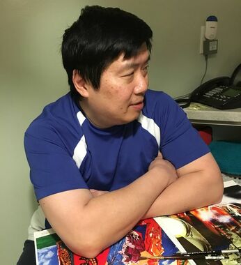
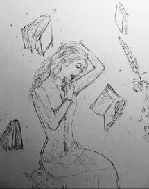
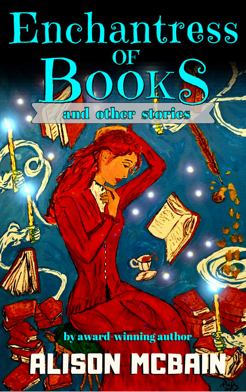
probably never) meet most of them in person, they are all wonderfully talented individuals who have come together for over sixteen years to create an online publication that has one of the largest readerships around. One such contributor is Bewildering Stories’ resident artist, Richard Ong. His bio shows that art is not his only creative endeavor; he does everything from writing to producing film, and his art and writing span multiple genres. A little bit more about him: 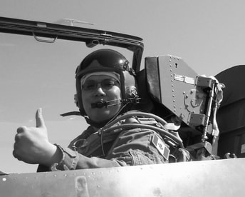 Up, up, and away! Richard in a jet plane (how he got there is answered in the interview below). Up, up, and away! Richard in a jet plane (how he got there is answered in the interview below). RICHARD ONG is a multi-talented renaissance man whose stories, poetry, artwork and photos have appeared in several issues of Bewildering Stories, Foliate Oak Literary Magazine and Yesterday’s Magazette. He is also one of the executive producers of a short film (“Angelics: Ascension” 2018) available for viewing at Amazon Prime Video. His non-genre-based literary work has appeared in print in two anthologies - “Toys Remembered” (2011) and “Serendipity” (2015), both of which are available in Amazon and Barnes & Noble. Not wanting to limit himself in individual publishing endeavors, Richard has also worked closely with the curator and senior staff of Toronto’s Gibson House Museum to create a pictorial story album titled, “The Gibsons – Prudence’s Story” (available in iBooks and Blurb 2015), giving the reader a virtual tour of the historic building. Richard has over a hundred published artwork online in which the original projects were done using a wide range of tools such as digital, acrylic and mixed media. In his (much) younger days, Richard’s reckless spirit of adventure once took him everywhere from rock climbing off a limestone quarry, glacier hiking in Iceland, freezing at -54 degrees Celsius in Yellowknife to photograph the Aurora Borealis, kayaking through small chunks ice bergs and playful humpback whales off the coast of Newfoundland and onboard a high performance jet fighter in St. Petersburg,FL. Although Rich and I have never met in person, we chat a lot via email about art and writing – in fact, Rich has created a beautiful piece of art to grace the cover of my forthcoming fantasy short story collection. We’ll get to that in a little bit, but first I’d like to welcome Rich. Hi, Rich, and thank you so much for chatting with me today. Just reading your bio makes me tired! You’ve accomplished so much so far. But let’s go back to the beginning. How did you get started in your creative endeavors? Hi Alison! Well.. where to begin. Hmmm. I guess you could say that I've always had a vivid imagination ever since I started reading my first book on "A,B,C." It was a little blue book with colorful illustrations of various types of objects. Beginning with "A as in Apple," the illustration of the delicious red fruit besides the letter fired up my imagination. I started to learn how to communicate in pictures as much as I did in words. In that same year (I was 3), I picked up a pen and drew lots of ice cream cones on the white spaces of every magazine that I could get my hands on. I grew up in a tropical country so for a sweaty energetic kid, ice cream was the closest thing to heaven. I also read a lot of comic books (Gold Key, Classics Illustrated, Marvel and DC) by "borrowing" from my older brother's book shelf. I also loved to copy my favorite heroes by tracing their photos from magazines using a carbon paper over a bond paper. That's how I first learned how to draw figures. Aside from superheroes (which we all love! I remember drawing those, too), what were some of your other artistic inspirations? Are there any artists in particular whose influence has had a lasting impact on your art? Back when I was in high school, I was smitten by the ultra-realistic paintings of Boris Vallejo and Rowena Morrill. I used to own some greeting cards based on some of Boris' exquisite artwork. Rowena produced some of the most colorful fantasy book covers and her mastery of depicting the look-and-feel of any type of clothing material was uncanny. In the world of comic books, George Perez and John Byrne were my heroes in my younger days. Fast-forwarding to the twenty-first century, my current inspirations are numerous which include the French and American Impressionists, William-Adolphe Bouguereau, Vincent Van Gogh, Salvador Dali and contemporary artists such as Olivia De Berardinis, Luis Royo and Julie Bell. Any environment can be a source of inspiration for me. Whenever I walk through the downtown core of Toronto, I would visualize the various buildings and cloud formations around me as raw materials for a future art project. My iPhone contains a lot more photos of inanimate objects than those of friends and family. These photos are all potential raw materials that I might later use for art. I feel the same way when it comes to my creative endeavors: inspiration is all around. Although I might get stuck on a particular story prompt once in a while, it’s hard for me to find myself in a dry spell when it comes to writing. And I’ve particularly noticed the same trend with you, Rich – you are very prolific in finding multiple outlets for your creativity. Is that one reason why you were interested in getting into film? How did you jump from individual artwork to producing? Ahh... that is one very long story worthy of a book! How did I get into film? I will try to condense it as best I can. Back in 2011, I was amazed at the people who made fan films based on established superhero icons uploaded into YouTube. These intrepid film producers spent a great deal of their life savings into their passions, personally funding almost the entire expensive production of their versions of Batman, Superman, etc for a short film. I contacted the owner of Redcape Cinema regarding an idea that I had for a fan film. That initial email blossomed into a detailed discussion on costumes, weaponry, character history, other props and locations. I never had any film school training but I can write a good story. Ron Santiano, the owner of Redcape Cinema Productions has taught me a lot about screenwriting. He is not only the producer and the director of his projects, he has worn so many hats the equivalent of a small studio crew to create movie magic. I was only involved in one film projects owned by Redcape – it's called "Angelics: Ascension" (and a 32 minute concept film is available on Amazon.com Prime Video and Amazon Prime UK). Thus, the original idea for a fan film evolved into an original superhero team production that is not associated to any existing comic book done in the past. Our initial 20111/2012 lengthy discussions and planning made us quickly realize that our superheroine is so unique that we've decided to go all the way and produce a truly original concept, untethered by anything that's ever been done in the past. By avoiding the fan film route and inventing our own original characters, we now have free reign to plan for a full length feature film in the future. Our working relationship is actually a long-distance affair spanning many years. The film was produced in California whereas I remained in Toronto. We also had other crew members who worked on the film from New York and the UK. "Angelics: Ascension" traveled a very long road from 2011 to 2018. It was a wonderful experience working with Ron Santiano and all the various Cast and Crew of this project. You asked me why I was interested in getting into film? We'll I wasn't initially. I just wanted to write a story. But the very idea of seeing your own story characters come to live onscreen intrigued me the more I thought about it. I just didn't know exactly what I was getting into back in 2012 when I decided to become more involved by co-producing with Ron the first trailer concept! What a ride it was since then. That’s amazing! I hear stories like that all the time from artists and writers – that they sort of “fell” into creating some of their biggest projects. Sounds like a happy accident that panned out (and is still panning out) for you, as well. Getting back to your art, you and I had been talking for a while about a collaborative project between us. I’m currently writing a short story based on your artwork “Crossroads to Martyrdom,” with the painting and story to be published shortly at Bewildering Stories magazine. But the big announcement today is the release of my short story collection, named Enchantress of Books and other stories. The collection takes its name from your painting “Enchantress of Books,” which graces the book's cover and also inspired the same-titled lead story of the collection. What motivated you in the creation of this beautiful piece? This latest artwork began its life as an idea. Wait. Let me start over. It began its life as an amalgam of a series of ideas. People who’d known me for a long time knew about my love of the Victorian Age. I’m the sort of person who would repeatedly visit a mid to late 1800s heritage home each year within the city. I’m also a fan of the Harry Potter movies although I have yet to read any of the original books. Therefore, when you combine magic with the polite simplicity of the Victorian Age and my love of vintage books -- you have the makings of the “Enchantress of Books” artwork. Now that I had an idea using the iconic governess or teacher as a character centerpiece, it was time to put everything on paper! Can you walk us through the process of creating a work like this?
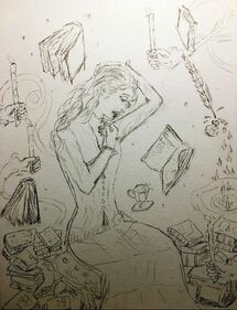
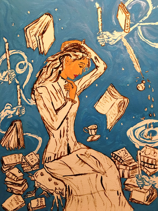
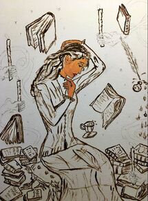 Figure 3 Figure 3 After the pencil sketch was done, I proceeded to paint over the same outline using a fairly neutral color like Burnt Umber. This served both as an “inking” mechanism and a means to render a dark contrast in texture (Figure 3). I chose to color the lady’s face next because to me, in order to set the tone for the artwork, I needed my character to come to life in the early stages of the project. As I looked at her face and the lush pre-treatment of her hair depicting what an ideal Victorian lady might’ve looked like in a carefree style, I smiled and knew from that point on, in what direction the rest of the colors would take. I use acrylic ink as my coloring mechanism. I like to use Daler-Rowney FW because among other brands of acrylic ink, their products usually have a thicker consistency, allowing one to use a heavier layer of color without having to resort to using the tube-based variety (which is better used on a canvas board). Sometimes, I use Liquitex Ink for special colors like Cerulean Blue. For those of you who want to get into this hobby, I cannot stress enough the importance of investing on a good set of brushes of different shapes and sizes, depending on the scale of your painting area. Recommended brands include Escoda or Winsor and Newton Galeria. A good quality brush will retain its resiliency after many uses long after the cheaper synthetics have become brittle and frayed. I always keep a tall cup of water beside me to wash the brush as soon as a different color needs to be used (but not blended into an existing one). A handy paper towel enables me to quickly dry the brush ready to be used on another ink. One thing to keep in mind is that water soluble acrylic paint dries very quickly. It is a good idea to sit back and contemplate on whether you plan to blend one color into another directly on the canvas or paper (called wet-on-wet because acrylic ink can only be mixed together while it remains as a fluid) so that you can prepare the different color components on your palette ahead of time. Okay, then. Now that you have an idea of some of the tools that I used for this project, let’s get back to its evolution.
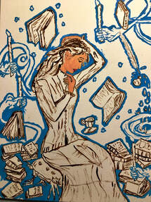
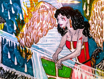
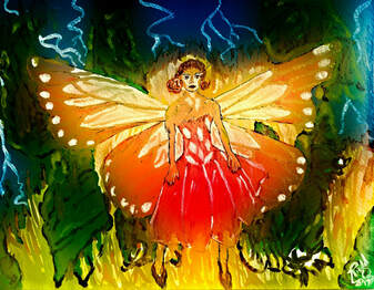
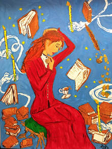 Figure 6 Figure 6 Finally, I painted over the rest of the character’s body and the objects around her (Figure 6). Notice the swirls of blue paint on the background around the floating books and tea cup. Using fresh acrylic ink, I created an illusion of motion in the air by dragging my wet brush rapidly in a swishing motion over the already painted background with the same blue color the way I imagined what air currents would’ve looked like. The more liberal the amount of ink is on the brush, the more pronounced the “swishing” impression would appear on paper (or on a canvas). This technique was also used to create flowing dark shadows on the character’s skirt suggesting the legs underneath the fabric. A similar but more delicate technique was applied to the character’s fair to make it flow free. Her left arm is raised in an apparent attempt to keep her hair from being blown by the blustery wind around her. The combination of the character’s posture, swirls of color and as well as shadows and light through contrasting shades of color all contribute to the action that gives life to a portrait. But wait! We’re not done yet. In the 21st Century, there is no excuse not to take advantage of various the photo editing tools available to further embellish one’s artwork. 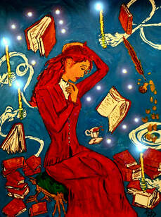 Figure 7 Figure 7 After taking a photo of the painting using my iPhone 6s, I added a few minor digital enhancements in order to create a more vivid image. The final result is shown on Figure 7. The advantage of using a camera to “scan” your painting (versus using a flatbed scanner) is that you can control what kind light and at what angle shines off your work. Warm yellow light is often my favourite choice. Sometimes, I would place the artwork on the backyard underneath the blazing sun in order to “feed sunlight” into the contents of the digital image. Photo editing tools use filters and other special effects that work with color content that already exists in your original image file. This is definitely where your photography skills will come into play. Instead of a person smiling in a suggestive pose, your own finished painting is your model. For this project, the photo editing tool that I primarily used is Photoshop. I first adjusted the brightness, the contrast and the midtones. Next I added lens flares on the candle lights and pixie dusts before further adjusting the brightness and contrast. The lens flare tends to add points of unwanted light on various parts of the image. I used the clone stamp tool not only to “paint over” these extra lights, but also to correct any overlapping paints between the character and the objects around her. And there you have it. The entire project was ultimately the result of combining traditional painting techniques, photography and modern software enhancements. I hope that you enjoyed this tutorial! 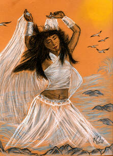 Dance of the Water Nymph Dance of the Water Nymph It was hard to choose just one piece of art from all of your lovely work to have featured on the cover of my short story collection, but “Enchantress of Books” really called to me, and I knew it was the one. You have such a body of work that I’d like to share some other amazing pieces by you. Here are several lovely pieces: “Dance of the Water Nymph,” “Parisienne,” “Siege of the Ice Fortress,” “Viking Queen,” and “Queen Titania.” Can you tell us a little bit about the inspiration behind each piece? For most of my painted artwork, the inspiration often comes from an image that I've seen.. whether it's from a billboard poster, a magazine ad or something I remember seeing on television. Colorful images trigger these sparks of inspiration inside me. I'm a very visual person that way. The first thing I do while the spark is still strong is to make notes on my iPhone. I have a note for story ideas and a separate note for artistic concepts. "Dance of the Water Nymph" was inspired by a live show that I saw from a local dance theatre. I also watch live performances of the National Ballet of Canada and I'm often amazed by the mechanics of the human body and painting the delicate "movement" of fabric over a supple, dancing figure is a way for me to capture that magic in art. 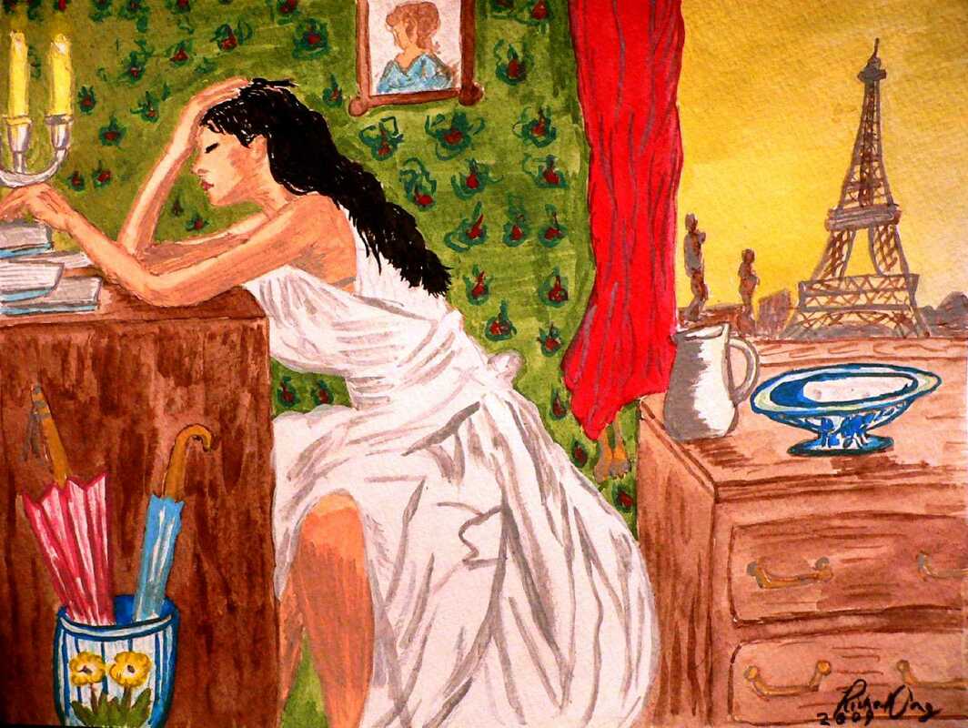 Parisienne Parisienne Just like "Dance of the Water Nymph," the "Parisienne" project started its life in an art workshop years ago in Toronto. Each student was asked to pick any subject to practice his/her newfound skills in acrylic painting. I've always been an admirer of the large body of work done by the 19th Century French Impressionists. Their quick interpretations of day-to-day life by regular folks were powerful and expressive snapshots that professional photographers would later emulate using technology – the ability to capture the moment of an act, as they'd say. The "Parisienne" was my attempt to depict a lady reading by candle light in what I hoped to be a remote approximation of Impressionism style. Did I make the mark? You tell me! 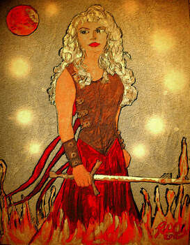 Viking Queen Viking Queen Both "Siege of the Ice Fortress" and "Queen Titania" are fun artworks with nothing else in mind other than the overwhelming desire to do some fantasy art. The heroine depicted in "Siege of the Ice Fortress" is an amalgam of a valkyrie, a human-eagle hybrid and an angel. In fact I originally wanted to sketch a fortress of light from heaven in the background but decided at the last minute to "freeze" everything around the warrior instead and ignite her wings. I wanted to show a gaunt, bloody and battle-weary figure valiantly standing at her post. As for "Queen Titania," I've always loved the dreamy, mist-filled quality of the fairy art done by the Victorians. And using one of the characters in Shakespeare's A Midsummer Night's Dream as the subject was perfect. Finally, there you have the "Viking Queen." Without a doubt, this artwork is in keeping with my love of traditional savage, fantasy, sword-wielding women like Red Sonja. The popularity of History Channel characters like Shieldmaiden Lagertha from "Vikings" might had something to do with it as well. There is a side-story behind the making of this painting. In its earlier stage of development, I wanted to have a small, poster-size print to see how enlarging the image would impact the quality of scanned art. I went to Fedex to scan and print the "Viking Queen" (this was before it earned that name). The fellow who worked on the cash register looked at my freshly printed art and whistled. "Who's this? Your neighbour?" he asked. "Oh, I wish!" I laughed. "I really wish!" I always love to hear the stories behind the art. It definitely humanizes the work to know the personal inspiration that goes into each one. I think most people think of an artist as sitting at home creating works in a light-filled studio and seldom getting out in the world. However, you’ve led quite an eventful life – traveled extensively and had quite a few adventures. In the picture you sent me for the interview, you’re sitting in a jet giving the camera a thumbs-up. Are you secretly a jet pilot in your spare time? Actually, would it surprise you to learn that I am secretly afraid of heights? It's true! I have always been afraid of heights. I don't get get any vertigo or anything like that when I look down the railing from a balcony of a tall building. However, my heart would beat a lot faster as I look down and I would get goosebumps with an overwhelming feeling that someone behind would push me over the edge. So why did I pay (twice) thousands of dollars for a thrill ride on a privately owned Cold War era L-39 Albatros jet fighter just to turn my stomach upside down at high speed above the waters of Tampa Bay, Florida? I did it for two reasons. One – I refuse to let my fears hinder me from experiencing some of the awesome things I want to do in life. Second – ever since I saw the movie, "Top Gun," I knew that I wanted to get on board a warbird one day and zoom right through the clouds regardless of the obvious danger. Of course I was much younger back then with fewer responsibilities. My priorities have changed since. Maybe. I wrote a short essay of my jet fighter experience for Bewildering Stories Magazine some years ago: "A Need for Speed." That’s amazing. And I think that’s an awesome takeaway: “I refuse to let my fears hinder me from experiencing some of the awesome things I want to do in life.” A great motto to live by. Thank you so much for chatting with me, Rich. It was great to learn about the artist behind the wonderful artwork. Thanks for doing the same interview, Alison! And now the big announcement: Rich has not only created the beautiful “Enchantress of Books” to grace the cover of my forthcoming fantasy short story collection to be released on April 1st, 2019. But he is also currently working on the cover for my next collection, which will be sci-fi stories, to be released in 2020. He’s creating a custom painting based around the feature story of the collection, “The Prototype.” I can’t wait to see it when it’s finished – and I’ll be sure to share it right here on my website as soon as it's done! Without further ado, here is the cover of my new book! Ta da! Enchantress of Books and other stories will be available for purchase on Amazon on April 1st, 2019... so stay tuned!
3 Comments
3/4/2019 11:53:41 am
I love this. Fascinating to see how a beautiful cover happens...
Reply
3/4/2019 07:35:06 pm
Thanks so much, Gabi! Richard is an amazing artist and it's been really great collaborating with him. With any luck, he and I will be working on many more projects in the future!
Reply
Leave a Reply. |
Who the heck is Alison McBain?I am a freelance writer and poet with over two hundred short pieces published in magazines and anthologies. Check out my 2024 writing challenge to write a book a week at Author Versus AI. For more info, please check out my "About Me" page. © Alison McBain. All rights reserved
Archives
July 2024
|


